Less than a third of you had read this book. If you are interested in World War Two books, this one's a goodie. It features two very different strong female voices, and reading each one's account of events, sometimes the same event from two very different points of view, is really interesting. One thing I found fascinating is that one of the characters is writing under extreme duress and knows that her words are going to be read by the enemy. So how much of her writing is true and how much is written to throw the enemy off? Sometimes the reader gets a clue, but sometimes the reader doesn't. It makes for layer upon layer of reading analysis, which is a fun game.
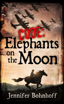
When I asked which cover grabbed your attention, people voted all over the board. However, the middle cover got the most votes. The middle cover is the one that I first saw, and I liked it well enough to use it as a good example when I submitted cover that I liked to the man who designed the cover for my World War II novel Code: Elephants on the Moon. It was a special favorite of those who'd already read the book but, interestingly enough, it was not the cover that those who'd read the book thought did the best job of portraying the book.
Almost all of you thought that the cover on the far right best depicted what Code Name Verity was about. This was true both for those who'd read the book and for those of you who based your opinion simply on my synopsis.
And one more bit of interesting data: no one voted for the cover on the far left. Not as the one that grabbed your attention nor as the one that best depicted the story. Interestingly, the cover on the far left is the one that you get when you go onto Amazon. I think that means that some publicist or advertising exec somewhere thinks that's the cover that will reel in the readers, but we disagree.
So, what do you think? I'd love for you to comment about how you voted and why, and I'd especially like to hear from those of you who've read Code Name Verity as to what you thought.

